
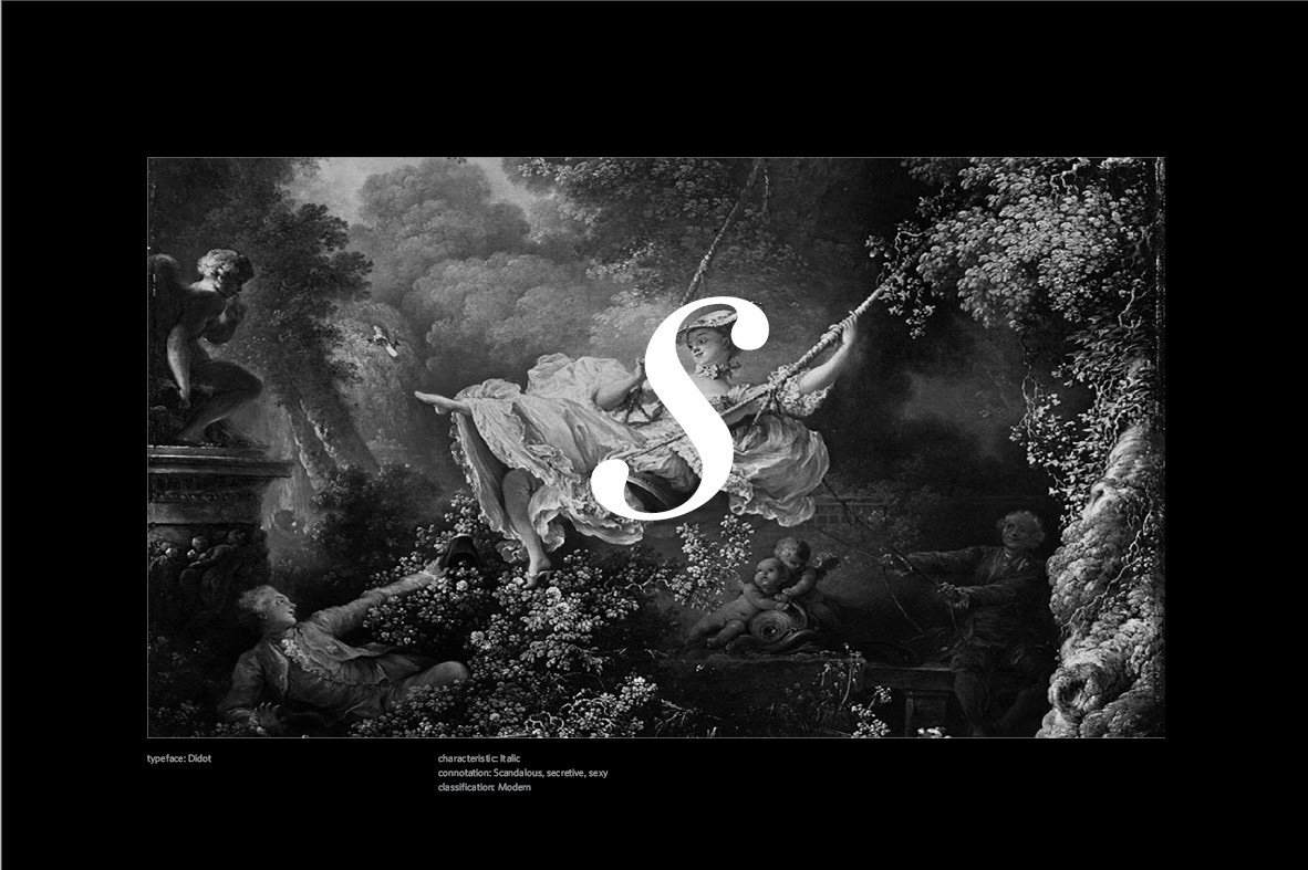
The era of Rococo art reflected the life of the monarchy; nonchalant, privileged, and beautiful. With this picture it just screams scandalous, secretive, and sexy. The S in the image echoes the sway of her body and the swing.
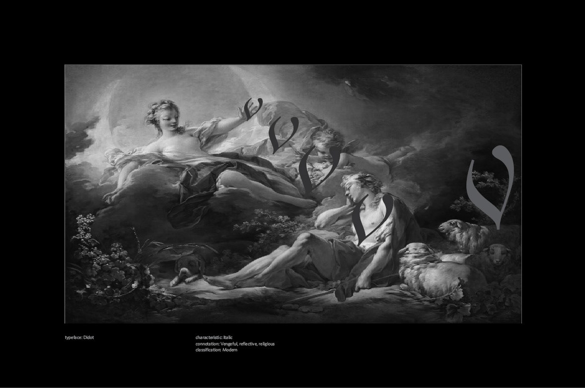
The use of the V was to show how I believe this angel is vengeful. This man has obviously done wrong, so I think she is somewhat acting her vengeance.
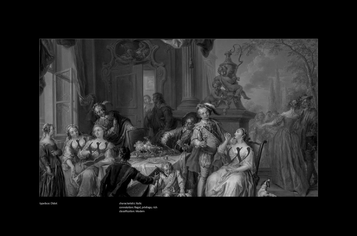
This Rococo painting highlights the wealth of the monarchy and the nobility. I placed the W on the women to show that they are showing off their wealth and power. It is to also echo the curves of their bodies and clothing that women at the time had.
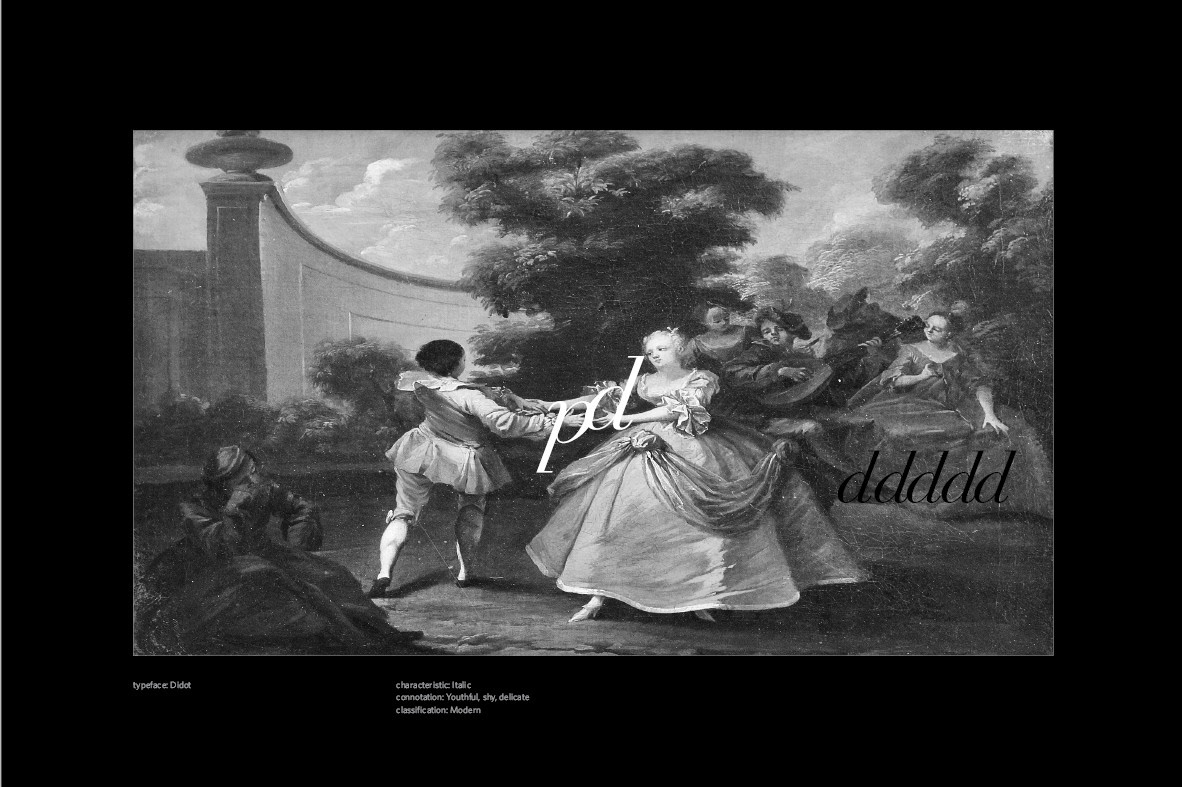
This image was a little hard to place the letterforms. Not only does this painting show the delicacy and youthfulness of these two, but also shows that this is more of a duty they must preform. From the young woman's face we can tell that this isn't something she's excited about. And the fact that they are so far apart they are barely holding hands. The people are that are in the back have just accepted this as normal and good.
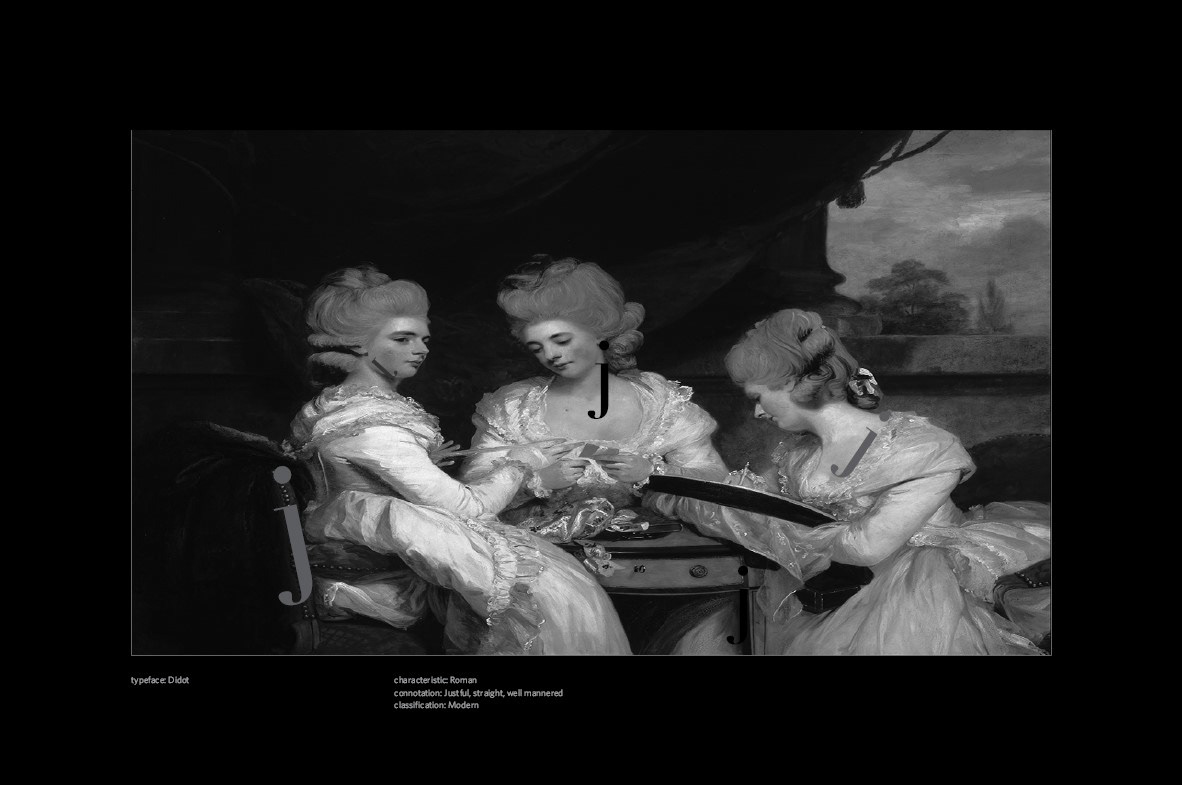
Choosing J was interesting; I wanted to pick a letterform that was mostly straight. Lean into the fact that these woman are very straight-laced and well educated. Or at least taught very feminine things. It was also interesting to learn that the painter is named Joshua Reynolds, a UK born man. Typically Rococo is associated with French culture and history.
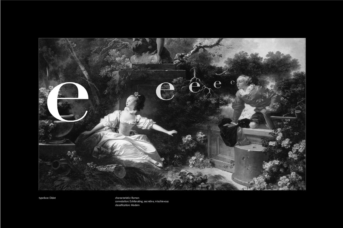
This was an image I kind of want to have fun with. Experiment with different placements and even the opacity of the letter E. The people depicted in most of these Rococo paintings are very youthful looking, whether they are older or not. Lowercase, I feel, reflects that with the fact that younger people can be smaller and inexperienced.